-1.png?width=3641&height=660&name=abcshedstransparent2%20(1)-1.png "ABC Sheds")
The colour of your steel shed has a major impact on its energy efficiency, durability, and visual appeal. At ABC Sheds, customers often ask us which is the best colour for a shed.
While it is ultimately a personal choice, certain factors will influence your decision, including the shed location, commercial or council requirements, and the shed colours in your area.
Considerations when choosing a shed colour
Commercial requirements
If your shed will be used for commercial purposes, it may be necessary to choose a brand colour. This may be a custom shade or a colour from the COLORBOND® range.
Council requirements
In areas of high visual importance, you may be required to choose a colour that blends in with the surroundings, and reduces visual impact. In some cases, a ‘light value’ rating will affect what type of cladding you’re allowed to use. To find out, you will need to ask your council directly to see what the implications could be.
Energy efficiency
Your shed colour will impact the interior temperature and energy efficiency. For warmer climates, light shed colours will absorb and retain less heart, helping to maintain a comfortable temperature inside. Darker colours will attract and absorb the heat more, which may be helpful in colder climates.
Sun exposure
Some shed colours fade faster than others when exposed to the sun. Generally, neutral-toned colours like beige, white, cream and grey tend to be more resistant to fading and will absorb less heat, meaning they look vibrant for longer.
However, COLORBOND® colours are known for their longevity, meaning the full range of classic colours will hold their colour over time. This includes whites, neutrals, light colours, greys, blues, reds, and blacks.
Visual appeal
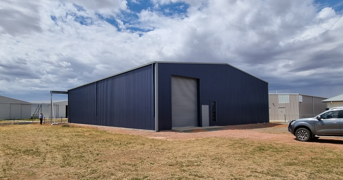
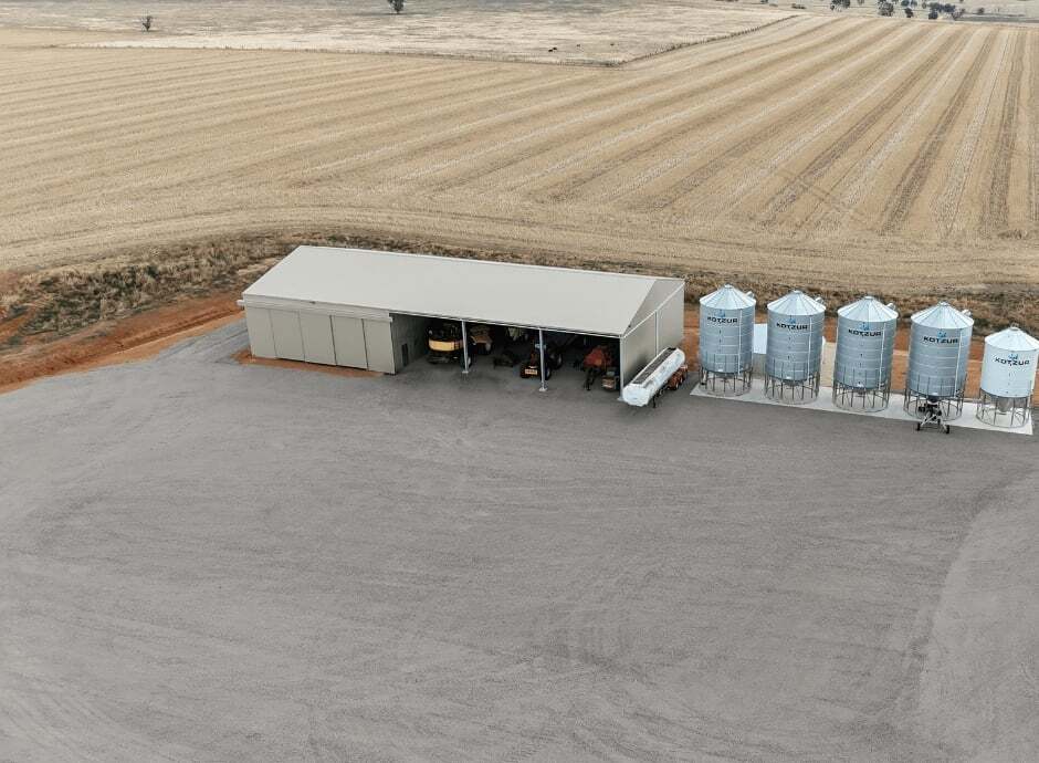
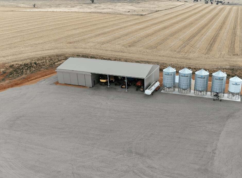
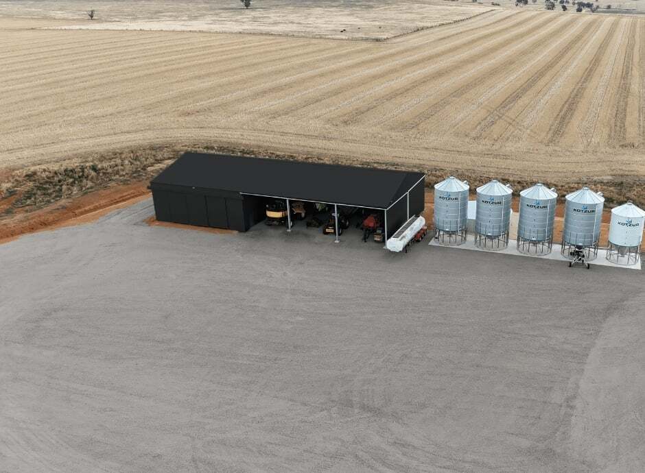
In addition to these practical considerations, your shed colour has a dramatic impact on the aesthetics of your shed and surrounding area. If you want the shed to blend in, choose a colour that matches the surrounding buildings, trees, and landscape. For example, this commercial shed in Mossvale ties in perfectly with its surroundings.
Alternatively, you could opt for a contrasting colour to make your shed stand out. For example, we love this bold blue horse arena in the Southern Highlands.
Dirt visibility
In areas where dirt and dust are often blown around, it’s worth choosing a shed colour that hides it well. Generally, darker colours show dirt and dust more and are difficult to keep clean. Lighter colours or brown-hued colours tend to hide dirt, depending on the type of dirt in your area.
For example, Dune®, Gully®, and Paperbark® are great options. However, if the dirt is mineral-rich and red, we’d recommend choosing Manor Red®.
Compatibility with your surroundings
It’s important to think about the other buildings and elements in the area. We recommend taking inspiration from your home, tanks, fencing, and the surrounding landscapes. For example, if your shed will be surrounded by native bush, the Woodland Grey® colour will be a great match. If you’re building in a coastal area, consider the Windspray® or Surfmist® colours.
Colorbond shed colours
Choosing the right colour for your shed is about more than just aesthetics. It’s also about energy efficiency, durability, and long-term value. That’s why we use the COLORBOND® range, which is designed for our climate and environmental conditions.
What is COLORBOND®?
COLORBOND® steel is manufactured in Australia with five layers of protection for maximum durability. It undergoes thorough testing to ensure corrosion resistance and longevity based on the Australian environment and application. COLORBOND® steel offers enhanced fire performance, simple maintenance, and a full warranty backed by BlueScope.
COLORBOND® colours
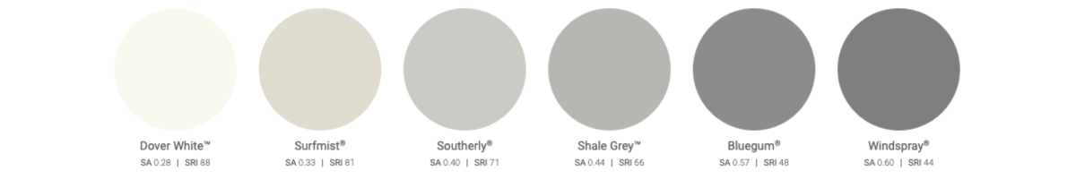
The COLORBOND® steel palette provides 22 striking colours, offering a range of options for various environments and applications. Whether your shed is by the coast or you want high energy efficiency, this range has the colour to match.
Dover White™
Dover White™ is a clean, crisp and timeless bright white. This endlessly compatible colour is ideal for tonal schemes or bringing fresh contrast to darker colours.

Surfmist®
Surfmist® is fresh, contemporary, and soft, inspired by the whitewash of surf beaches and the warmth of native blossoms. This is an enduring colour with timeless appeal, suitable for a subtle scheme, pale tones, cool and warm greys, and whitewashed and limed timbers.
.jpg?width=940&height=690&name=surf%20mist%20colourbound%20(compressed).jpg)
Southerly®
Southerly® is a cool grey with pale tones providing abundant possibilities in both residential and commercial designs. When used in roofing, walling, and shed doors, it enhances concrete and pale timbers while contrasting with rich-coloured brick.
Shale Grey™
Shale Grey™ is calming and soothing, inspired by the reflection of silvered tree bark and the engrained beauty of granite. This is a light, delicate and warm grey, complementing a variety of building materials, including granite, dark timber, and grey brickwork.
Bluegum®
Bluegum® is inspired by cool horizons, morning mists, and mountain gums. This is a relaxed grey with a calming mid-tone, working comfortably with dark timbers and natural stone finishes.
.jpg?width=940&height=690&name=Bluegum%20colourbond%20(compressed).jpg)
Windspray®
Windspray® is inspired by cool sea mists and summer breezes, offering a restrained and mid-strength tone of grey. It works effortlessly with other materials, such as concrete and weathered timbers.
.jpg?width=940&height=690&name=Windspray%20colourbond%20(compressed).jpg)
Classic Cream™
Classic Cream™ has timeless appeal, with a warm and welcoming yellow tone. This colour is reliable and confident and can be used for various building styles.
.jpg?width=940&height=690&name=Classic%20Cream%20colourbond%20(compressed).jpg)
Paperbark®
Paperbark® is comfortable and warm, containing soft and delicate tones based on the iconic Paperbark tree. This muted, pale brown colour includes hints of cream and grey, making it versatile and easy to match with light timbers, contemporary bricks, and neutral renders.
.jpg?width=940&height=690&name=Paperbark%20colourbond%20(compressed).jpg)
Evening Haze®
Evening Haze® is subtle, calming, and earthy, inspired by our limestone coastlines and dry grasses. This warm colour blends brown and grey tones, making it easy to coordinate with lime-washed timbers, pale textured bricks, and muted metallics.
.jpg?width=940&height=690&name=Evening%20Haze%20colourbond%20(compressed).jpg)
Dune®
Dune® is soft, comforting, and natural, with warm, blush tones. This is easy to combine with natural building materials such as mid-tone timbers and limestone.
.jpg?width=940&height=690&name=Dune%20colourbond%20(compressed).jpg)
Gully®
Gully® offers quiet warmth, inspired by the earthy tones of river clay, pebbles and stone. Gully® is a mid-strength and subtle tone, versatile for use with limewashed bricks, natural stone, and render coatings.
.jpg?width=940&height=690&name=Gully%20colourbond%20(compressed).jpg)
Jasper®
Jasper® is a warm, reddish-brown, inspired by the rural rocky outcrops and the ageing bark of eucalypts. It is a solid, reliable, and grounding colour, easy to match with timber, bluestone and bricks.
.jpg?width=940&height=690&name=Jasper%20colourbond%20(compressed).jpg)
Wallaby®
Wallaby® is a soft, muted, mid-range grey. This colour is easy to combine with brown timbers, red-brown bricks, concrete and blackened steel detailing, bringing subtle depth and variation to any palette.
.jpg?width=940&height=690&name=Wallaby%20colourbond%20(compressed).jpg)
Basalt®
Basalt® is a rich, deep, and solid grey, suggestive of enduring strength. Inspired by the mineral tones of ancient rock, this is a cool grey that blends effortlessly with greyed timbers, recycled brick, and concrete.
.jpg?width=940&height=690&name=Basalt%20colourbond%20(compressed).jpg)
Woodland Grey®
Woodland Grey® has a dark, grey-green tone, inspired by inland bush and coastal scrub. This is a chameleon colour, complementing any material, including sandstone, granite, slate, dark timber, and more.
.jpg?width=940&height=690&name=Woodland%20Grey%20colourbond%20(compressed).jpg)
Ironstone®
Ironstone® is a deep steely blue, inspired by stormy skies and wild coastal seas. This is a sophisticated and deep colour, which complements bluestone, glazed brick, and warm neutral colours.
.jpg?width=940&height=690&name=Ironstone%20colourbond%20(compressed).jpg)
Deep Ocean®
Deep Ocean® is a strong blue, based on the intensity of ocean depths and mountain ranges. This is a strong and adaptable colour, both for traditional and modern building design, pairing beautifully with beige tones, pale grey concretes, red brick, and dark granites.
.jpg?width=940&height=690&name=Deep%20Ocean%20colourbond%20(compressed).jpg)
Monument®
Monument® is a dramatic and modern colour, inspired by the volcanic rock along our southern coastline. This is a deep and empowering grey, combining easily with rich timbers, crisp whites, and silvers.
.jpg?width=940&height=690&name=Monument%20colourbond%20(compressed).jpg)
Pale Eucalypt®
Pale Eucalypt® is a rich, calming, and versatile tone of green. This gentle muted tone blends easily with warm timbers, mixed stone, and pale, neutral bricks or cladding.
.jpg?width=940&height=690&name=Pale%20Eucalypt%20colourbond%20(compressed).jpg)
Cottage Green®
Cottage Green® is a traditional, deep green inspired by the emerald freshness of national parks and fertile hills. This is a strong and vibrant accent colour, suiting a range of traditional building styles and bringing energy to suburban and rural settings.
.jpg?width=940&height=690&name=Cottage%20Green%20colourbond%20(compressed).jpg)
Manor Red®
Manor Red® is inspired by the earth and ancient rocks of our vast and striking inland expanses. Where a bold focus and vibrancy are required, this rich red is difficult to beat, particularly when used alongside sandy stone, painted bricks, weatherboards, or black metal detailing.
.jpg?width=940&height=690&name=Manor%20Red%20colourbond%20(compressed).jpg)
Night Sky®
Night Sky® is pure black, offering a strong and neutral contrast colour. This colour is powerful and robust, ideal for emphasising, highlighting, and contrasting elements of a building to create drama and focus.
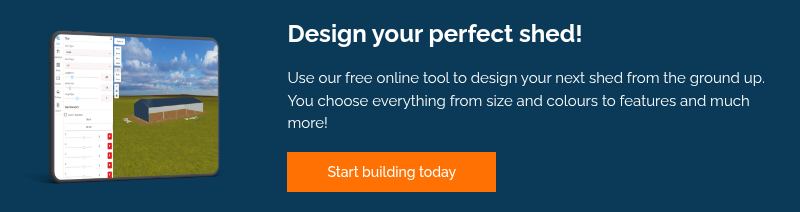
Design your custom shed
Ready to see your shed in these COLORBOND® colours? Use our free online shed builder to design your dream shed and see what it will look like.